Here is my final CD Digipak design. I have linked in imagery and characters from the music video to create similarity between all my work. I feel clips of a festival helps the audience to recognise the type of artist Disclosure are, as it gives of an up beat and electronic vibe.


Digipak Construction: Design Two
I came up with an idea of including the characters from the music video. Therefore I did some photography of the two individuals and then added text in 'disclosure' and 'settle' on top of the pieces of paper. I feel that the age of the characters means the target audience of a similar age will be directed.


Digipak Construction: Design One
First of all I started with the front cover. I took this photograph at a festival and links well with the electronic duo Disclosure. I felt that the image should be neutralised and have a slightly lower contrast. I added a white image over the top and then reduced the opacity, this resulted in a less intense image which made adding text much easier.


I then added the artist and name of the album to the front cover, I went for the font 'Eurostille' and a grey colour to match the colour scheme of the rest of the photograph.


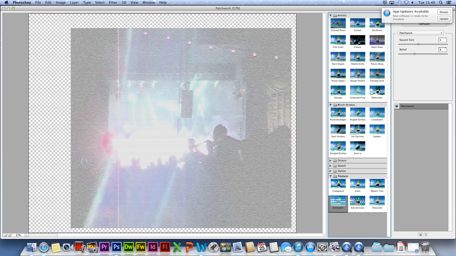
I played around with some of the filters in Photoshop however I preferred having the image as it was.


I then chose my back cover photograph. I went with another festival one as it create synchronisation within the Digipak. Also this particular image had a nice place to put the track list.

I then experimented with the different image combinations I could use on the inside part.


I finally decided to go with this combination, as I liked my other design idea I just decided to combined the two. Also I made two of the photographs black and white. I did this as myself and other people I asked thought as an overall piece these images would look better not in full colour. I think it works better as it isn't too busy and intense. As you can see below I looked at different font options however I went back to my original decision.


Practice Digipak Design
 |
| This is the template I will be using to create my CD Digipak. |
 |
| I have chose an image of Disclosure to go on the front. I like this image as the red light is effective and gives a glimpse of what the electronic duo's music is like. I changed the size to fit it to the section I wanted. |
 |
| To confirm this transformation click the tick at the top of the screen. |
 |
| I then chose the inside front and back cover, I decided upon a photo that would stretch across both sides to create flow. |
 |
| For the outside back cover I selected an image I liked but wanted it to be in less saturated to link with the inside. Therefore I went to 'Image' > 'Adjustments' > 'Hue/Saturation...' |
 |
| Then I sliced the bar down on Saturation and clicked Ok. |
 |
| I then dragged it into my CD Digipak composition. |
 |
| When exploring font colours for the track list I found it was difficult to see the writing therefore I decided to make the photo more exposed and dream like. To do I went to the same setting as above but increased the lightness. |
 |
| I selected a grey colour for the font that's slightly darker than the background. |
| I chose the font Eurostile as I liked that it was clean and simplistic. |
 |
| I then centred the font and placed it in the centre of the back cover. |
 |
| I used a website to generate a random barcode to place onto the back of my Digipak as this is a common convention. |

 |
| I kept it small and placed down the bottom as it is not an important feature. |

Annotating Disclosure's Digipak


To further explore the conventions of a digipak I looked at an existing bands design and picked out certain conventions and what they portray.


The following information was taken from this site.
"The first disc records, ones that we would recognize as such, appeared around 1910. Most often these were packaged in plain brown Paper or cardboard sleeves. Occasionally and enterprising retailer would print his store name on the sleeve but generally they were unadorned.
In the early 1920's retailers started gathering many of these cardboard sleeves and binding them together with heavy paperboard or leather covers. These looked similar to large photo albums and, borrowing the name, were sold as record albums. These albums offered much greater protection for the discs than the original packaging and were seen as indispensible to disc owners that had seen too many of their fragile records broken.
Beginning in the 1930s the record companies started using these record albums to distribute bundles of records from one performer or a collection of performers with similar musical styles. Some of the first cover designs can be traced to these albums and the record company’s desire to graphically communicate the music each album held.
Alex Steinweiss the art director for Columbia Records is given credit for the concept of modern cover art. He experimented with different concepts and images through the late 1930s and into the early 1940s. During this time Columbia Records rebounded from the terrible years they had suffered during the depression to become one of the most prominent record companies in the United States. Much of this was due to their ground breaking use of graphical design. (Of course signing Frank Sinatra may have helped a little too).By the close of the decade all major recording companies had graphic design professionals on staff.
The golden era of cover art design began in the early to mid 1960s and lasted into the early 1980s. During this time the major format for music was the 12 inch, long play disc or LP. Cover art became a part of the musical culture of the time. Often used to express graphically the musician’s artistic intent, it helped connect and communicate to listeners the message or underlying theme of the album.
Designers, photographers, and illustrators sometimes became famous for their cover art creations. Such notables as Andy Warhol and Frank Frazetta were taken from being known in their industry to becoming household names due to their cover art graphic design work. So respected and desired are the designs and illustrations found in cover art that there are numerous art galleries that specialize in helping collectors find rare album covers.
As the medium for recording transitioned from the LP to the compact disc many graphic designers failed to transition with it. Having worked for so long with the much larger canvas of the LP cover, switching to the smaller CD case left most designers dissatisfied with their results. Often artist and record companies simply tried to shrink the LP size art to fit the CD.
Album cover art, now almost exclusively CD and CD packaging artwork, went through a period of change and rebirth in the 1990s. Designers learned to capture snapshots and portions of the artist’s musical intent rather than trying to convey the entire message. Also designers started conveying the emotion of the music rather than the musical intent.
In the late 90s computer design programs started to overcome the physical limitations of the smaller CD packaging. With the ability to draw much tighter, finer lines and have even small details look crisp and sharp, once again designers were free to explore a larger variety of design options. As the technology continued to improve graphic designers adapted and were once again producing world class artwork.
In the present, CD design is undergoing a true renaissance. Rather than becoming obsolete in the digital age as many thought it would, graphic design is once again proving itself as the difference maker. The internet is now the largest record store imaginable. Now rather than browsing a few hundred albums or songs at a time you may be exposed to thousands and thousands. Since it would be impossible to listen to portions of all those thousands of songs the design of the accompanying artwork must cause potential listeners to stop and take notice and give this album a try."
No comments:
Post a Comment